THE PERFECT TV AND FILM PITCH DECK EXAMPLES
Crafting a successful film pitch deck is an art form. It’s a unique mix of an engaging visual presentation and captivating written copy, perfectly crafted to engage your target audience. Whether they be potential investors, a production company, studio executives, interested cast members or a creative team, it’s important to get your vision across clearly.
Here at Vicious & Co we specialize in crafting stand-out, one-of-a-kind, TV and Film Pitch Decks that help you nail your creative projects. We take pride in offering a collection of Film Pitch Deck Examples that serve as a guide to what we do, as well as hoping it will be an invaluable resource for filmmakers and others trying to develop their own film.
THE ULTIMATE GUIDE TO TV AND FILM PITCH DECKS
Table of Contents
Key Elements of A Successful Film Pitch Deck
There are no hard and fast rules about what has to go in your pitch deck or how to structure it. This should serve as a guide for your film project, and you can add (almost) whatever sections you need.
Cover Slide
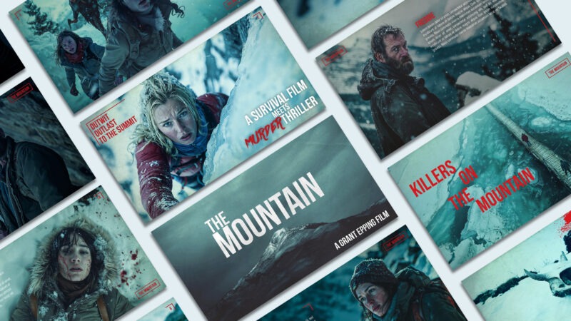
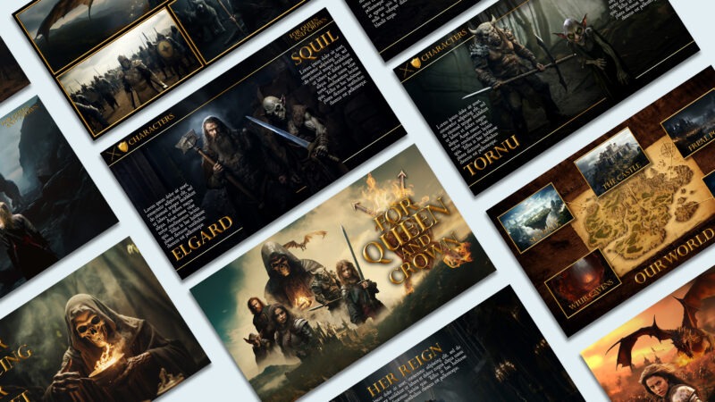
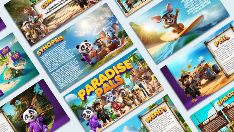
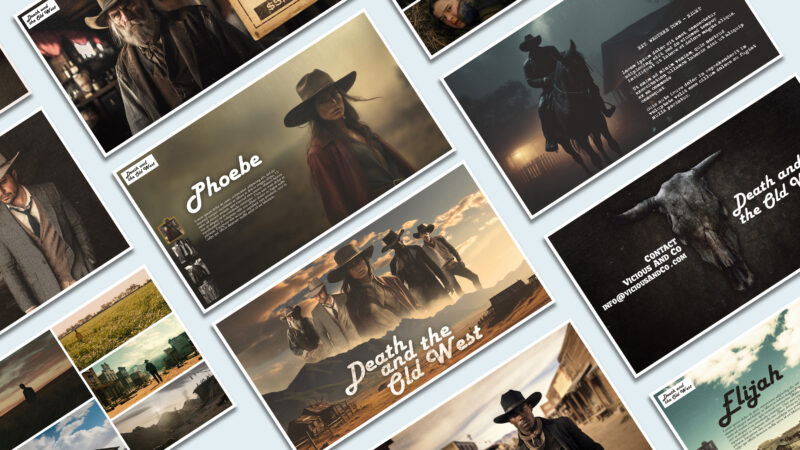
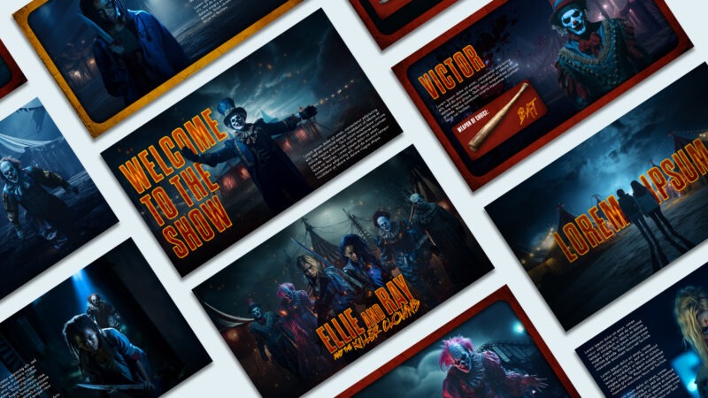
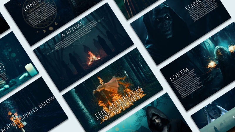
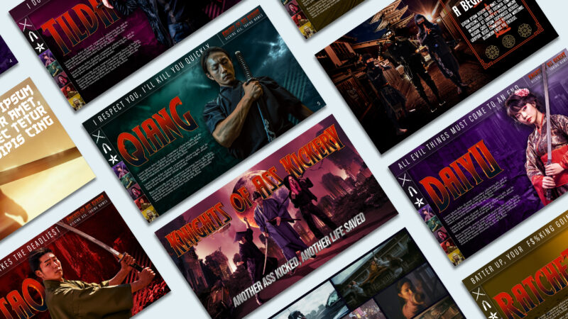
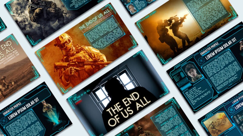
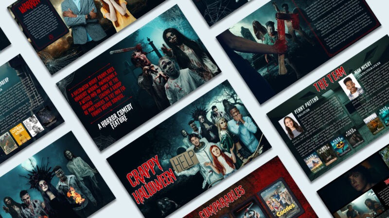
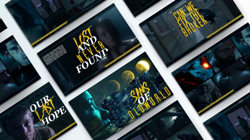
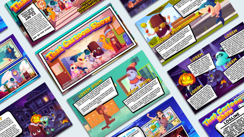
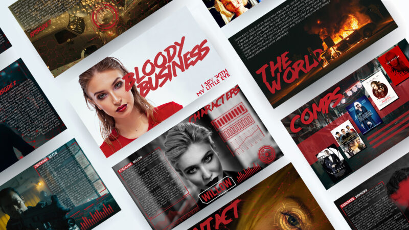
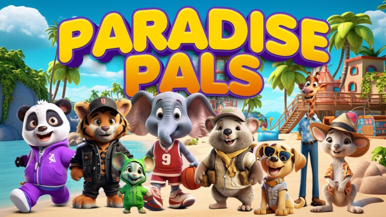
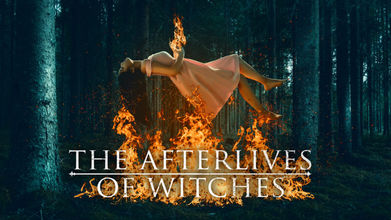
The cover of your pitch deck is the first thing potential investors or producers will see, so it should be attention-grabbing and reflect the essence of your project. Use a high quality images or artwork that conveys the mood and genre of your film or TV series. We like to create highly stylized cover images like those below, and while you don’t have to this detailed, make sure they stand out.
Logline
The logline is a one or two-sentence summary that encapsulates the core concept of your project. It should be concise, intriguing, and pique the reader’s curiosity. Visually, you should utilize this page to add another story element to your deck, something that may not have been shown on the cover page. It’s also the place we would add clickable links to trailers, websites, or anything else that is essential for your reader to see upfront.
Synopsis / Story / Summary
The synopsis is your chance to provide a brief overview of your film’s story and it’s characters. Think broad strokes, including key story beats while leaving enough room for intrigue. One of the biggest problems we see is clients trying to give way too much information during this section.
Characters
Introduce the main characters of your project. Provide brief descriptions of their personalities, motivations, and roles within the story. Include any notable character arcs or development that will make them compelling to the audience. Make sure to emphasize how these characters drive the narrative and contribute to the story’s appeal.
Be sure to use images that represent the “look” of your character. If they’re a fireman make sure you use an image that clearly depicts this.
List your characters in order of importance
Very minor characters they can likely be omitted.
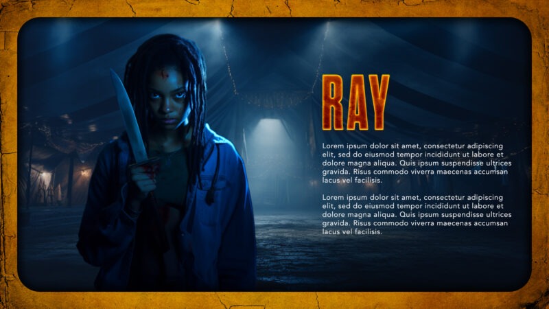
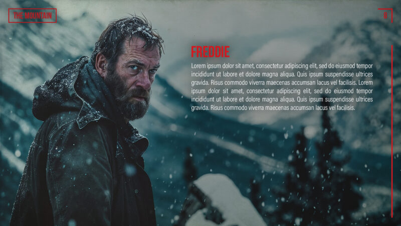
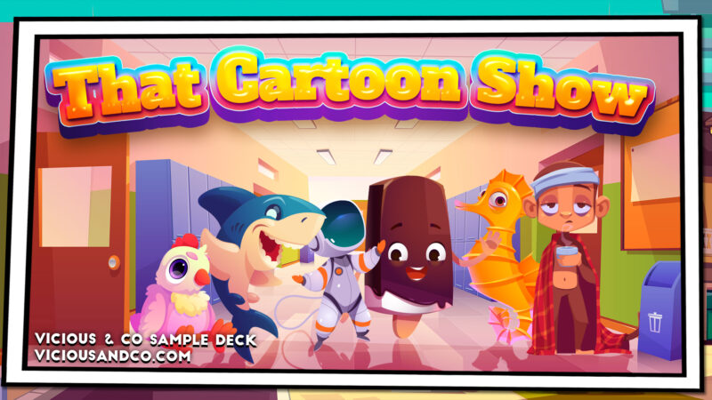
Even without real text the look of each of the people below reveals elements of their character.
Tone and Style
Use this section to convey the tone and style of your project. Is it a lighthearted comedy, a dark thriller, or a heartwarming drama? Describe the visual and narrative style you intend to use, and provide references to other successful work in a same genre or style to help convey your vision.
Be specific about why and how it will evoke a certain tone.
Use visuals that reference your talking points
Think of how you’d describe the tone of other films.
Clarify any subgenre where appropriate (eg: Slasher vs Body Horror, etc.)
The World
Give an overview of the world your story is set in. Whether it’s a post-apocalyptic wasteland, a magical kingdom, or a bustling city, provide insights into the world-building elements that will captivate your audience. Explain how the world complements your story and helps create a unique viewing experience. Images as references are key. Be clear, tell and show people what your project is… and isn’t.
Team Members
Introduce the key members of your creative team — this can include the writers, director, producer/s, cinematographer, and any other notable crew attached to the project. Highlight their past successes and qualifications to showcase the team’s capability to bring your project to life.
As much as your story will sell the project, having an experienced team in place that investors, a network, or a production company can trust will help even more.
Other Elements You Can Include In Your TV Show or Film Pitch Deck
Episodes
For a TV series pitch deck, the most common approach is to outline the pilot and then also provide an outline of the first season’s episodes. However, as with everything, this is not a hard and fast rule. Some people like to simply provide “episode ideas,” while others do an entire “season overview.”
Be sure to include main plot points, character developments, and how they contribute to the overall story arc. Highlight any notable twists, character conflicts, or cliffhangers that will keep viewers engaged.
Future Seasons
As with the episodes section, the approach to future seasons is up for debate. It’s become common practice to include outlines for future seasons (typically seasons 2 & 3). While this shows you know where you’re story is going, at this stage, it’s all theoretical. Showing that your show has “legs” is important but everyone viewing the deck is going to be aware these future season ideas are far from set in stone.
Comparable Titles
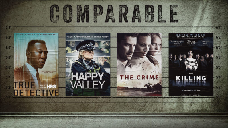
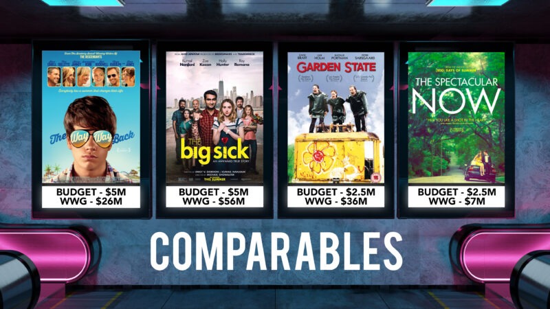
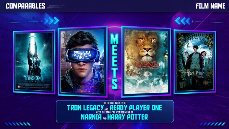
Comparable Titles can be used for a number of reasons. You are relating your show or film to others that it compares to in one of a number of ways. These include:
Comparable genre/story/tone.
Comparable for similar budget and possible success (include box office numbers).
This films ‘meets’ this film approach.
Script Excerpts
Short sections of text directly from your script that showcase key scenes from your project. Make sure you use great visuals to highlight these excerpts.
Personal Team Statements
These commonly include statements by key team members involved in the film project. Film is an artform that tells person stories. Why is this film important and why are you the right fit?
These include things like:
Director’s or Writer’s Statements
Why This Show?
Why Me and Why Now?
Budget, Financial Projections, and Investment
One of the biggest factors that helps a film with securing funding is its commercial potential and the chance that it will provide profit to potential investors. If you’re going to persuade investors, make sure you have all of your financial elements in place.
Budget – for the purposes of a pitch deck include either a budget total or top sheet data but make sure you have a detailed budget breakdown available on request.
Financial projections – utilize a film professional to provide projections for what your film project could likely make. Don’t just guess.
Investment – include information on the investment opportunity you are giving to interested parties.
Actual Pitch Deck Examples From Real Films and TV Shows
Stranger Things Pitch Deck (originally titled Montauk)
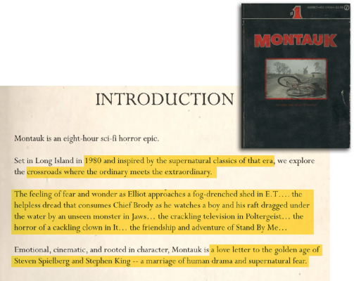

This is the deck that everyone talks about. Partially because it’s Stranger Things — a massively successful show, and partially because it’s really good. But what does it actually do really well?
The deck establishes tone: They used the highly stylized 80’s paperback as the backbone of their whole pitch deck. It worked for their project. You can find something just as unique as yours.
The text gives clear info. It defines itself and what it is immediately. It is the 1980s, supernatural, E.T., Jaws, Poltergeist, Stand By Me, A Love Letter Spielberg and King. THIS IS ESSENTIAL INFO TO LEARN AT THE START.
You would read the rest of the deck differently if you weren’t presented with this info first. Think about that in relation to your project. Is there vital info that would change a reader’s perception of the rest of the deck?
A Quiet Place (taken from film pitch video)
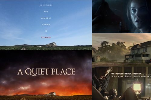

The visuals above were taken from a short pitch deck video by the writers of A Quiet Place. While it’s not technically a film pitch deck its goal was the same — use instant visual cues and great cinematic visuals from similar films to capture the aesthetic of their film.
Even before the film was made the vision was so strong. These images are so close to what would be the final film. Visuals set up their tone and script excerpts revealed story elements. Use a similar approach for your projects — remember film is a visual medium and compelling visuals are key to capturing your audience.
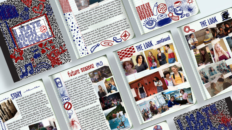
Freaks and Geeks (taken from the TV Show Bible)
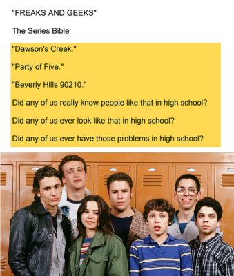

While this isn’t taken from a pitch deck, but rather a TV Show Bible, it is the opening text to the document and does an amazing job of setting up the show.
It nails the feeling and tone straight out of the gate. It’s the anti-all-these-other-shows-show.
It addresses the reader and poses questions. This engages the audience and makes them want to know more.
The writing has a playfulness to it. Tone doesn’t just come from visuals, it’s in the writing too. Don’t make the writing boring.
Common Pitch Deck Mistakes and How to Avoid Them
Start Your Project Strong
Get to the good stuff… and do it quick.
Time and time again clients come to us with their deck for their film project which they have already written and it is messy, wordy and all over the place.
Whether they are just too close to their script to really see where it shines or they think the audience needs 3 pages of intense backstory to “fully understand their intricate world” (clue… we don’t), what they usually present is several pages of meandering, excessive details to start that just don’t need to be there.
Incorrect Visual Tone
Start by setting the tone. One of the biggest problems we see in TV and movie pitch decks is incorrect visual tone or a lack of consistent visual theme.
An example I use often is if you were pitching a horror film about a cabin in the woods. People often find stock images or images that depict the place or thing they’re talking about and use them in their deck but they pick something that really isn’t visually appealing. So you choose a picture of an old cabin, but it’s in the middle of the day, it’s sunny, it looks more like a real estate shot — there’s nothing visually appealing that sells the reader on the horror aspect of your project.
Think about who your target audience is; what do they want to see?
Instead, make sure you find an image of a cabin that’s reminiscent of a horror film, something cinematic — think night, dark, with creepy woods surrounding. This note on visual tone should obviously be applied to whatever genre you’re working in. If something is comedic, make sure the visuals you use are comedic in tone, if it’s an action film, do the same. Choosing images with the correct visual tone will help set up your project in the correct light.
Too Much Text
Far too many decks try to give too much information about their project and in doing so their pages are filled with mountains of text, half of which isn’t necessary. While you should cover all your key points, understanding when you have too much text is important.
Read your content, understand where you’re waffling or straying from your key points, and cut the word count down. Execs and producers see a lot of decks (as do we), and there is nothing more daunting in a pitch deck than staring down page after page completely filled with text.
Missing Information
To counter the point above about too much text, I have also seen far too many decks with missing information. As the writer of the project, you’ve spent hours, months, possibly years, crafting the ins-and-outs of your story. You see how ‘A’ gets to ‘D’ because this entire world is in your head. But for the person viewing your deck, they need parts ‘B’ and ‘C’ in order to connect the dots.
Remember, your reader doesn’t have the vast knowledge of your story that you do. If it’s not on the page, they aren’t going to know about it, and the only thing worse that a story that’s too long, is a story that doesn’t make sense because something is missing.
How To Avoid These Common Film Pitch Deck Mistakes
Ask people (friends/family/colleagues) to read your screenplay pitch deck. Then, have them ask you questions or have a conversation. A big part of my job is simply asking clients the right questions and discussing the project.
After reading a draft of a pitch I will write down questions I have. Where are the holes for me as the reader/audience?
It’s amazing to see how quickly someone has that vital information just roll off the tongue. Asking those questions and discussing the project will typically be met with missing information that connects those vital elements I was missing.
Frequently Asked Questions
What program should I make my movie pitch deck with?
There are a number of programs you can make your pitch deck with, including both free and paid.
Powerpoint ($)
Keynote ($)
Google Slides (Free)
InDesign ($)
Photoshop ($)
Canva (Free or $)
How long should a film pitch deck be?
There are no hard and fast rules about the length of a TV show or film pitch deck. However, as someone who has designed thousands of pitch decks for clients, there are similarities across most of them.
A feature film pitch deck is typically 10-15 pages in length but this isn’t a rule.
A TV Show pitch deck is typically 15-20. As with film pitch decks this a rule.
How much text should I include?
This is always up for debate but a good rule of thumb is that less is always more. Pitch decks are intended to be show your visual world and are typically an initial document to entice interested parties. If you can grab someone’s attention with your initial deck, they’ll want to know more.
We advise our clients to use a maximum of 200 words per page but again, less is more.
Can I use images from other films?
Yes, you can use any images you find whether they be from film, TV, or any other source as film pitch decks are intended as private documents sent to private parties.
Where can I find images for my film pitch deck?
There are numerous places you can find images for your film pitch deck. Ensure you are using high quality images so your pitch deck looks as professional as can be.
Some of those include:
Can I include artwork in my film pitch deck?
Yes, include sketches, storyboards, concept art, stills and anything else that will help show your vision.
How do you pitch your project to Hollywood?
Practice your craft. Build a network. Work on getting things made (writing, producing, directing, etc.). It all takes time and patience. Getting a job in the film industry is the best start.

